
A special commission for 16 pieces of wedding jewellery and gifts came about when my work was seen at a market last May.
The lovely couple were getting married in September at House for an Art Lover and wanted jewellery with a vintage vibe. This was just perfect as the Flow Creativity signature petal & leaf design has that vintage look. I was thrilled to be asked and after a couple of initial online meetings, began working on designs and visited the venue for inspiration.
Here I tell the story of how I took colours and shapes from what I saw, combined with my designs, to match the colours of the outfits.
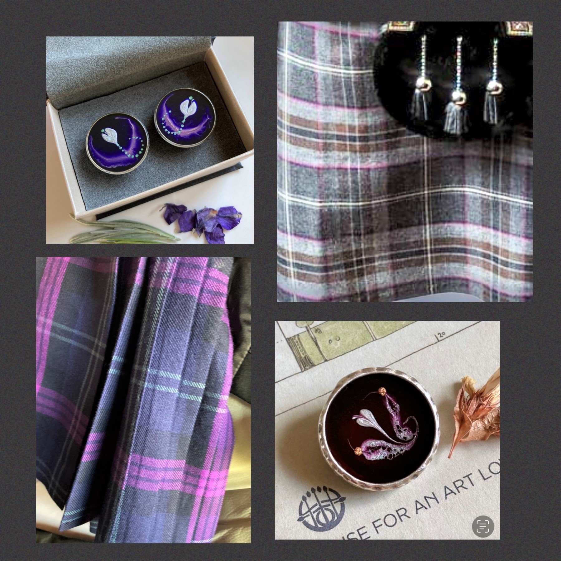
Part 1 of the Blog begins with the two tartans being worn by the groom and his father, and by the groomsmen and groomswomen.

The Kilt being worn by the groom and his father; vibrant purple against deep blue with a line of green.
I loved the textures and colours of the curtain fabric top right. Grids resembling the tartan pattern also showed up many times around the House.

Cufflinks for the groom and his father.
The signature Flow Creativity petal in pearl surrounded by a vibrant purple leaf impression against the deep blue of the kilt. Picking up the green line from the kilt; domed dots forming a stem in a curved line .
Much inspiration for these colour palettes were found at the iconic venue.
Before moving onto the groomsmen and groomswomen design; two more pieces are included here to illustrate the blue and purple design aesthetic.
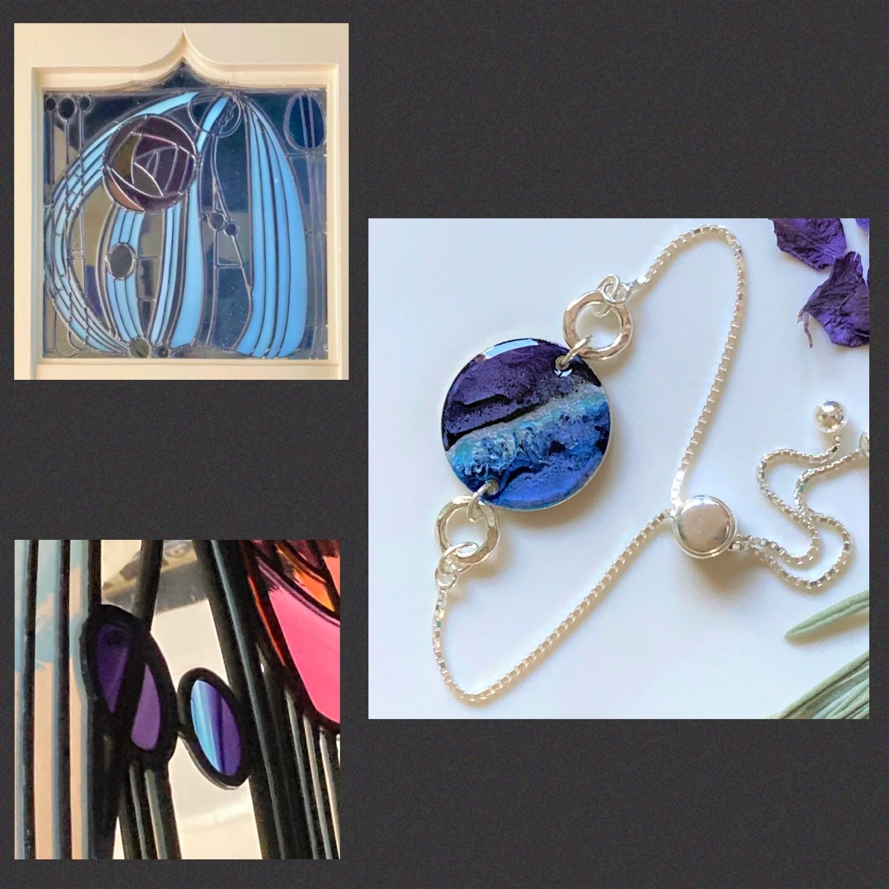
Gift for the groom’s mum ~ Sterling Silver Slider Bracelet in flowing design picking up the same blue and purple colour palettes.
The design can be seen in many ways; purple sky above frothy waves, or (the other way round) a purple heather landscape below a typically robust Scottish windy sky.
What do you see?
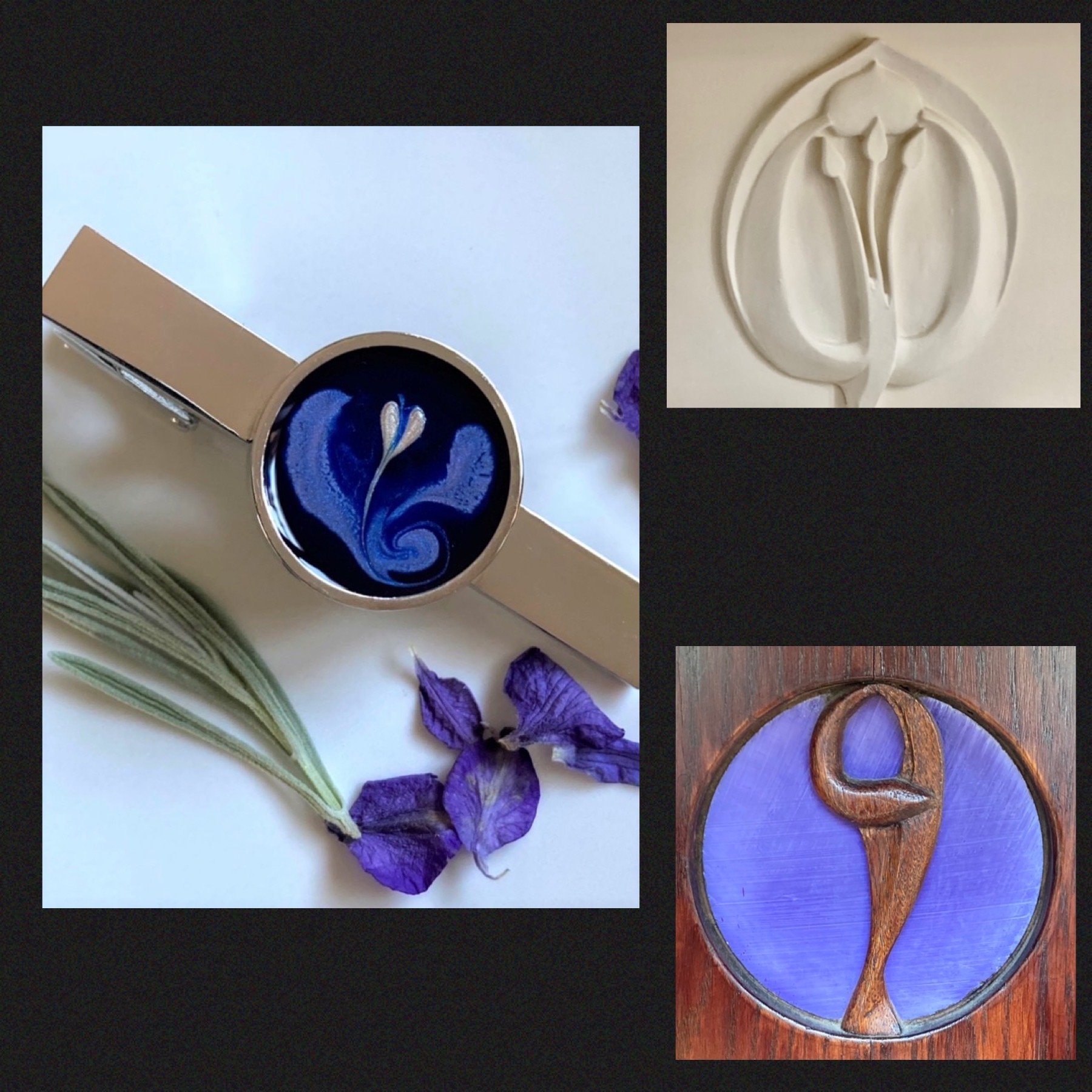
Tie Pin for the bride’s uncle, to match a pink shirt and blue suit.
.
The petal in pale pink surrounded by a violet leaf impression again vibrant blue. Aspects of my work are inspired by the Art Nouveau genre and as a Glasgow resident,
I’ve been fascinated for many years by the aesthetics of the Glasgow Style of Charles Rennie Mackintosh and Margaret Macdonald. These pieces that caught my eye at House for an Art Lover reflect how I’ve been inspired by the genre.
And now to the five groomsmen and groomswomen who would have lapel pins…

Tartan with gray tones with brown and fine lines of cerise and white.
There was plenty of inspiration at House for an Art Lover ~ read on to see how the colour palette was reflected in the pins.

Lapel Pin Brooch
The brooch was being worn on a grey jacket, so a background colour of a deep magenta was a good way of creating a contrast. The leaf impression is a smokey silver which shows up the magenta, with domed dots in bronze picking up the brown.

All five pin brooches
Looking at them closely, you may see subtle differences between each brooch. Due to the application and setting of paints, no two pieces of Flow Creativity jewellery are exactly the same. This adds to the uniqueness of the pieces.
A key learning point for me was mixing the paints in new ways to get the tones just right. This has enabled me to bring a greater variety of tones into my work.
If you or someone you know is interested, I have space for one wedding commission for 2024 and space for initial conversations about wedding commissions for 2025 and beyond. Contact me here for a complementary initial conversation about commissions:
Part 2 showcases the jewellery for the bride and bridesmaids ~ meanwhile, thank you for reading; l’d love to hear your your thoughts on the pieces.