• Jewellery & Craft Gallery
  • Etsy Shop
  • Craft Markets
  • Stockists
  • About
  • Blog
  • Newsletter Sign Up
  • Reviews
  • Contact
Flow Creativity
  • Jewellery & Craft Gallery
  • Etsy Shop
  • Craft Markets
  • Stockists
  • About
  • Blog
  • Newsletter Sign Up
  • Reviews
  • Contact

A Story about Seconds (Circularity Blog Series)

In preparing for a recent Seconds and Samples Market (at wasps_Artists Studios, Glasgow), I was inspired to write this Blog with some inside stories about my approach to quality and the various factors that can lead to an item being a “second”.

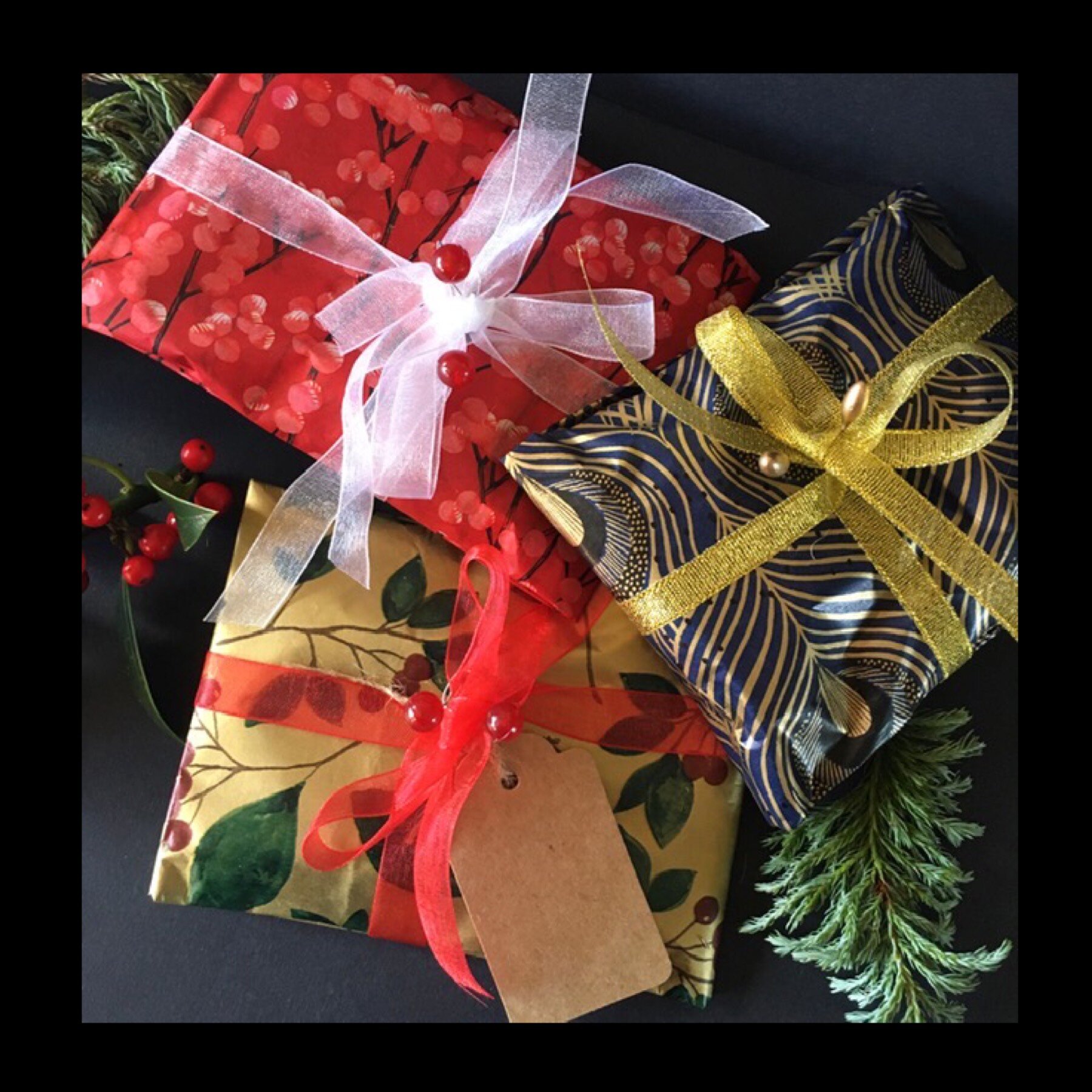
This is the first in a blog series about circularity and how I bring re-purposing, recycling, zero waste and eco packaging into my work.

Making jewellery seconds available (at discounted prices) contributes to circularity by reducing wastage of what might, if I didn’t make them available to buy, ultimately end up being discarded.

Rather than hiding away unappreciated in my stock cabinet, these seconds become treasured pieces to be worn, loved and shown to the world.

So what determines a piece of my hand painted jewellery becoming a second?

First off, as a stickler for quality, I set the bar pretty high for what makes the grade, so most “seconds” items are still of very good quality.

In the main, most seconds relate to various aspects of using resin. (This is what I apply over the hand painted pieces, once the paint is dry).

All set up for a resin batch (photo shows the earlier Emerald Nouveau Jewellery pieces and Coasters in Aqua tones).

The two most commonly occurring issues (although thankfully not too frequent!) are resin bubbles and dust particles.

Flow Creativity 3 - Ocean Pendant - Second.jpg Resin Bubble on Ocean Pendant Hand Painted blue and silver design Flow Creativity.jpg Dusky Sky Stud Earrings-Sterling Silver-Hand Painted Scottish Jewellery-Second-Resin Bubble-Flow Creativity.jpg Resin Bubble on Sterling Silver Hand Painted Dusky Sky Stud Earring.jpg

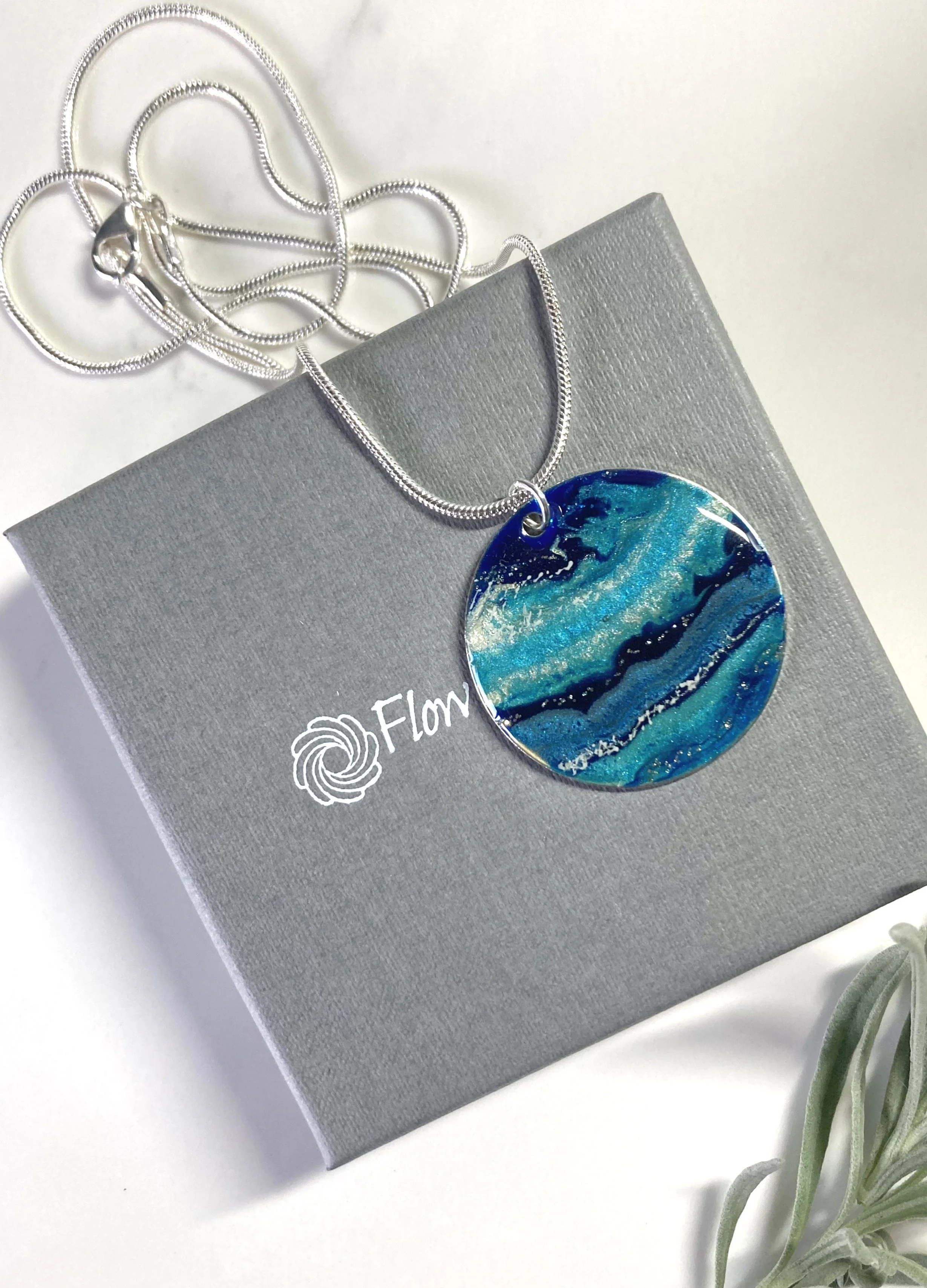
Pictured above are two items with a resin bubble. The bestselling silver plated Ocean Pendant has, on this occasion, one remaining tiny bubble in the middle - can you spot it?

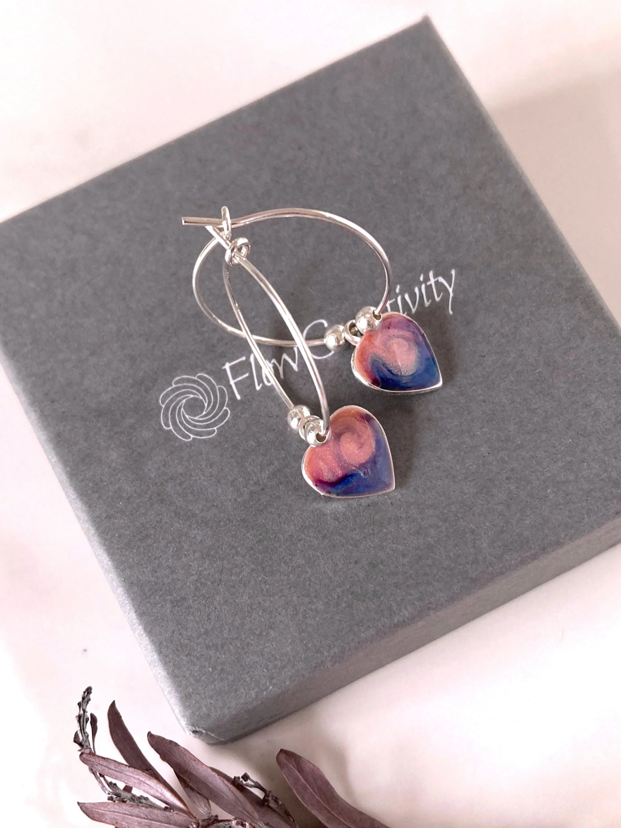
Next are a pair of Dusky Sky sterling silver Stud Earrings. One has a resin bubble over the blue paint towards the bottom.

The photos of the bubbles have been taken under a magnifying glass - the standard photos show how hard they are to spot with the naked eye. This demonstrates the quality standard I adhere to with my work.

Pictured below are some dust particles on one of the popular Forest green and gold stud earrings. “Now you see it, now you don’t”. The magnified picture shows a small stitch like line on the left just above the gold band. Again, hardly visible to the naked eye and even then, it only is apparent when light moves over it.

Forest - hand painted green and gold - stud earrings - dust particle second - Flow Creativity - Scottish Jewellery.jpg Dust particle on Forest green and gold stud earrings - Flow Creativity.jpg

How do resin bubbles and dust particles occur?

Working with Art Resin involves mixing two components which then form a thick bubbly liquid. The next steps are:

  • applying the resin to the jewellery pieces using a cocktail stick (or pin for the really small pieces!)

  • using a kitchen blowtorch to get rid of the bubbles

  • checking for any remaining resin bubbles and dust particles with a magnifiying glass

checking for resin bubbles using a magnifying glass

Bubbles occur when I’ve missed seeing them - I’ve learned not to have too many tiny pieces on the resin tray as this is how the bubbles get missed! Having the larger decorations on the tray helps to manage the proportions of what I’m checking.

The tray of jewellery and decoration pieces are placed under a perspex box for the resin to do its magic.

Dust particles occur when they settle on the resin before it is covered over for its 72 hour curing process. Again, I aim to thoroughly check each piece, however sometimes things are missed.

Some other resin issues that can occasionally occur include:

  • resin spill on the sides or back (this occurs when too much resin has been applied to the piece)

  • resin slightly pinched at the side (due to not enough resin being applied)

The other aspect that leads to pieces being deemed seconds is the about painting process. This can either be a flaw in the setting of the paints or the piece not being reflective enough of the intended design.

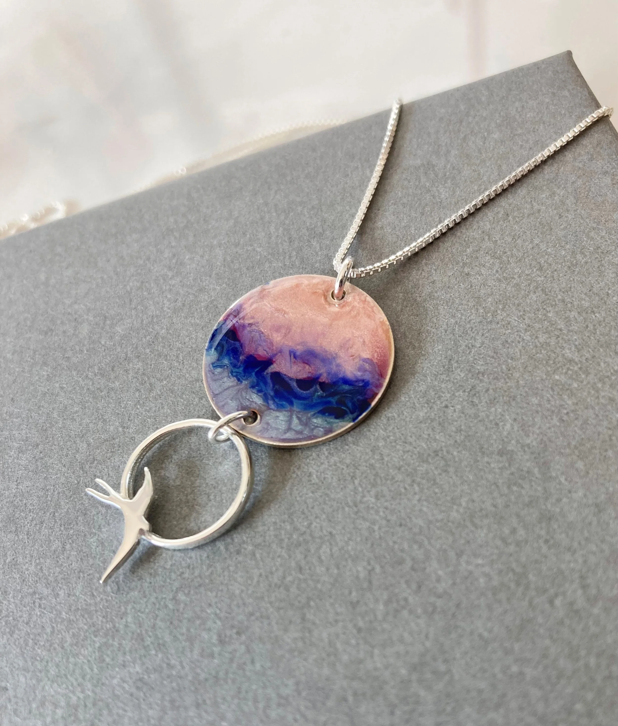
In the pendant below, as the paints have settled, a small blob of the dark mauve has remained - usually it merges with the pale pink.

Vibrant Dusky Sky Heart Pendant, second due to setting of paints.

Hope you’ve found this a useful insight to what leads to my jewellery pieces being deemed “seconds”. Hope too that you can see most of the seconds are still of high quality.

The level of discount is based on the nature of the flaw and how visible it is.

Owning a “second” is a great way to enjoy a beautiful piece of jewellery at a discounted price while simultaneously contributing to waste reduction. And what’s more, in chatting with people at markets, for some there’s a distinct appeal in owning something that has a different aspect about it (making it even more unique).

I usually have some seconds to be snapped up at markets, so come along and ask about the stories behind the seconds!

Check out my Craft Market schedule to see where I’ll be next!

Craft Markets

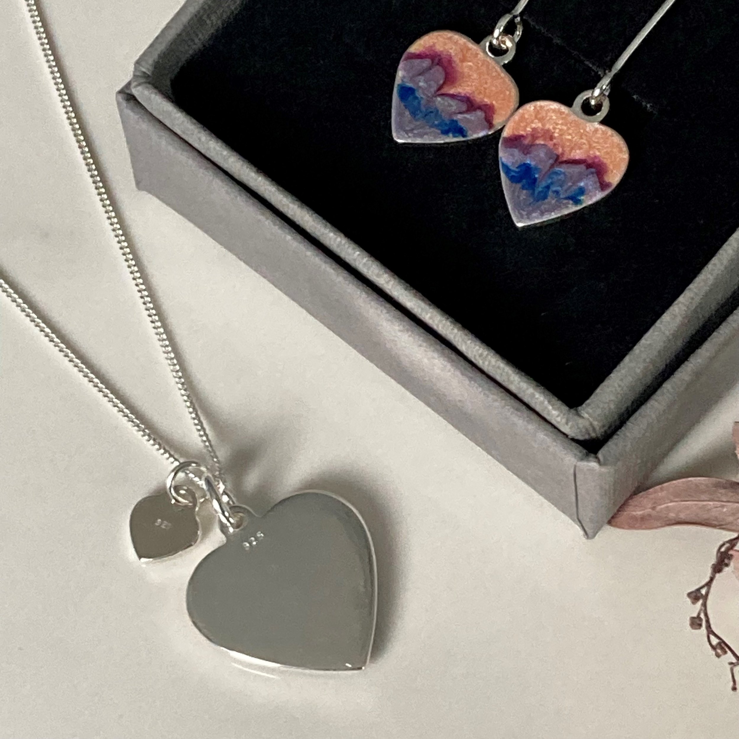
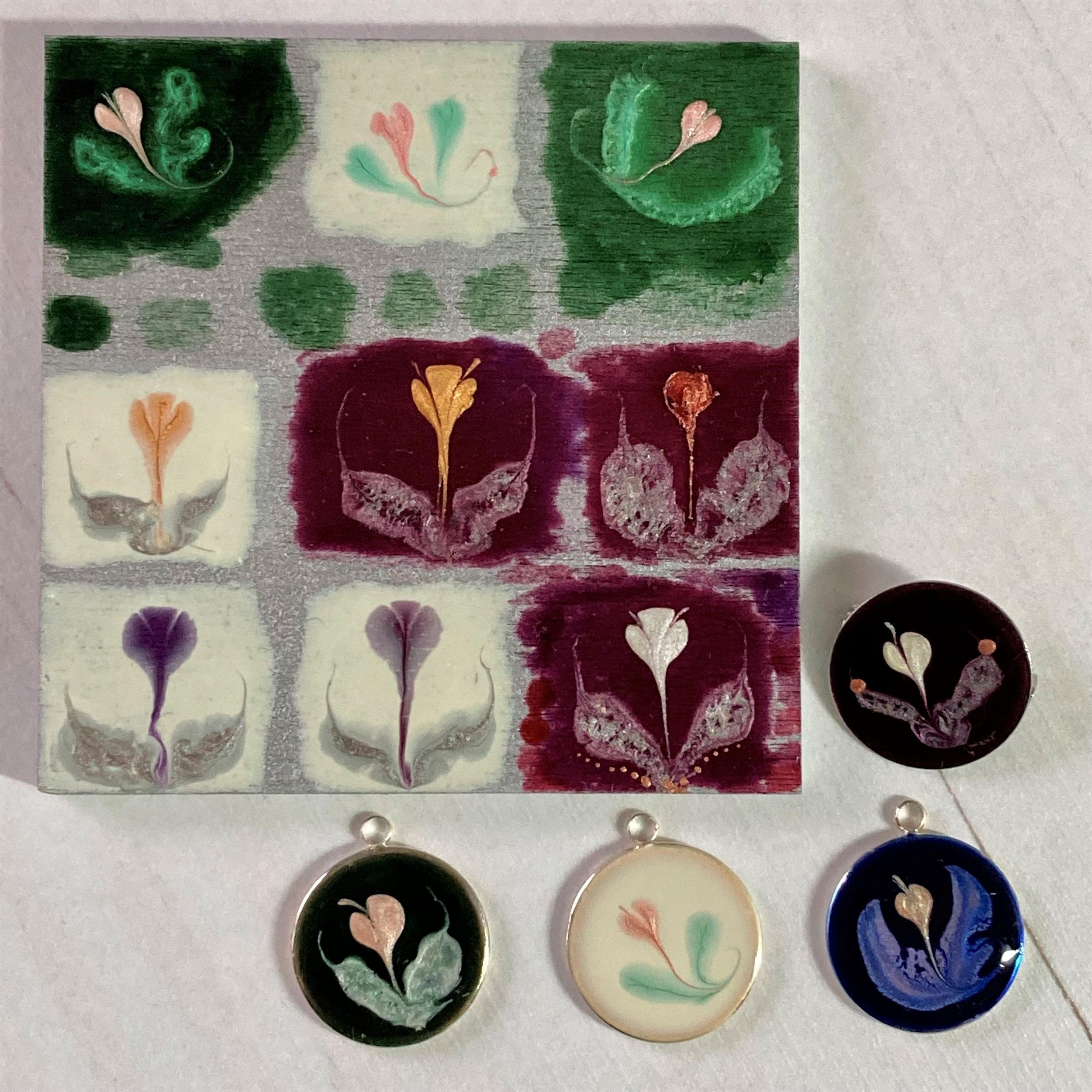
Here’s a selection of current and recent seconds.

To help give you a bargain, some of the lower priced pendants are attached to cord and displayed on cards. Gift boxes and various chain lengths can be purchased at the market.

IMG_4750.jpg
Dusky Sky Stud Earrings-Sterling Silver-Hand Painted Scottish Jewellery-Second-Resin Bubble-Flow Creativity.jpg
IMG_4752.jpg
IMG_4760.jpg
Dusky Sky Heart Pendant - Second-paint blob- scottish jewellery - Flow Creativity.jpg
IMG_4771.jpg
IMG_4770.jpg
IMG_4774.jpg
IMG_4773.jpg
IMG_4775 (1).jpg
IMG_4781 (2).jpg
IMG_4779 (2).jpg
IMG_4765.jpg
IMG_4763.jpg
IMG_4778.jpg

Thank you for reading

Thursday 03.27.25
Posted by Justine Murray
 

Perfectly Imperfect

A re-take on perfectionism!

At a recent market, I had one of these special conversations that stays with you.

It’s always lovely when people are interested in the process of what you do. Initially I was explaining that working in small batches results in subtle differences because it’s about the alchemy of what is inside me in that moment interacting with the paints.

Indeed the name Flow Creativity was drawn from the concept of “flow experience”; a term coined by a proponent of positive psychology Mihali Ciskszentmihalyi - a state of mental immersion, leading to losing one’s thoughts in the task at hand.

Entranced by the paints

Mask, goggles and gloves on! But once I settle in and visually connect with the vibrant colours, I get immersed in the process and (when relaxed enough) let the magic happen!

In turn, during the market conversation, a connection was made with theology - about St. Augustine and the state of inner peace. It really is wonderful when these chance moments happen.

I’ve been wishing I could remember more, however consider this; that from a spiritual perspective ‘flow experience’ is about connecting to something beyond oneself - whether a greater force, god, the universe - and in finding inner peace through that, creativity emanates from a place of inner stillness.

Can you relate to getting lost in a practical task?

Like cooking or gardening (or tending much loved house plants) when the need to focus whether visually or by other senses dominates over our everyday internal narratives.

Or certain types of exercise require 100% focus on one’s surroundings as well as the task; e.g hill climbing or wild swimming for safety reasons.

So lets contrast this to our everyday states of rushing around, getting ‘things done’. And add in a perfectionist streak for good measure - we can see that ‘flow experience’ and ‘inner peace’ are not really within touching distance…

Sounds familiar?

I must confess I’m no exception to that. At times driving myself to over-do, not pausing for a sense of completion before adding more to the to-do list!

Over the years, I’ve got better at managing that, however the one area it remains present is my creative work; quite ironic, given “flow experience” and “flow creativity” eh?

I justify to myself that it’s about quality, and yes, of course that’s important.

I’ve also noticed that if I’m rushing (or in a slightly frantic “lets get it done”) state of mind, it 100% affects my work.

And if while painting, I sense that something is really not working, I wipe off the paint, and start again, or just decide to switch task and return to it another day.

Switching tasks - there’s always jewellery to be made up; adding earring hooks or chains to pendants.

However, there are other times when I’m painting and the effect isn’t exactly as intended but it could have an appeal. These pieces go into a mental “decide later” box.

And this is really what I mean about unhelpful perfectionism; to re-do pieces which already have an appeal is creating a lot more work for myself! (and yes, I’ve done this!)

But back to that market conversation….it was put to me that that work I’ve deemed imperfect has its own story and therefore its own value.

And that I could tell the story of some pieces that were not exactly as intended, but yet beautiful in their own way.

Wow!! that was quite a profound revelation for me

  • a) the realisation that even with all the learning from my coaching years (which I draw on daily) I was still judging my work, perhaps too harshly

  • b) it would be ok to share with people that it’s not always perfect

The spirit of this perspective is not unlike Kintsugi - the Japanese process of rebuilding broken pottery with metallic laquer emphasing the joins; thus celebrating the breakage as part of the history of the piece.

So here is a story about one of my more complex designs - Dusky Sky.

Did you know…that five different paints make up the Dusky Sky design?

As well as my inner state, another aspect that plays into my work is the condition of the actual paints which, as I’ve discovered over the years, start to thicken after opening, changing the interactions between the paints.

So, rather than striving for the same exact look every time, I’ve given myself over to accepting that differences in paint consistency will impact on the designs.

But “accepting” these differences is not quite the same as “welcoming” them, (back to the alchemy from that inner state of flow….)

So I’m paying more attention to the condition of each of the paints and learning how to use their proportions accordingly - encouraging a state of curiosity within myself about how it will play out.

That doesn’t mean it all goes swimmingly though. With the most recent batch there were two pairs of earrings that went into the ‘decide later’ box; I felt they had more of a stripe than a blend.

After the market conversation, I looked at them afresh and could see the beauty and value in them just as they were.

And so now…drum roll…here are two pairs of Perfectly Imperfect Dusky Drop Earrings!

IMG_7988.jpg IMG_8001 sq.jpg

And here’s a canter through Dusky Sky batches since its inception in 2022 - do you have a favourite? Maybe you can spot your very own piece of jewellery here?

IMG-0022.jpg IMG-3701 (1) copy 2.7 copy 3 FINAL.jpg IMG-4427.jpg IMG-7894 sq.jpg IMG-7898.jpg IMG-3876 (2).jpg IMG-2255 (1).jpg IMG-3191.jpg IMG-2067.jpg IMG-5897.jpg IMG-3195 sq.jpg IMG-3489.jpg IMG-3262 less tint.jpg IMG_3423.jpg IMG_7798 sq.jpg IMG_7811.jpg IMG_7898 (1) square 2.jpg IMG_7895.jpg IMG_7873.jpg IMG_7804 (1) square.jpg

Hope you’ve found this an interesting read - with some thoughts on perfectionism and an insight into an aspect of my work. Do let me know what you think in the comments below.

Meanwhile a very sincere thanks to the people from the market conversation for prompting me to see imperfection in a new way and find the courage to share this and tell this story…

Friday 05.31.24
Posted by Justine Murray
 

Postage Update - April 2024

Following some changes to Royal Mail UK signed for service, I’ve reviewed postal charges across all items. The changes are in line with what I feel is appropriate insurance-wise.

Note this Blog will be updated as and when other changes occur. Prices are correct as at April 2024.

The changes mean reductions for postage for items £40 and under, and increases to postage for items £41- £49.

There are no changes to postal arrangements I use for International Items with prices consistent with Royal Mail at the given time.

Here is a schedule of UK postal charges that I’m using with additional notes where necessary:

Note that standard postage is second class; this can be upgraded to first class at checkout.

Earrings £28 and under:

£1.55 second class standard

Pendants £28 - £40 and Earrings £29 - £40

£2.70 Tracked 48 (second class)

This replaces the signed for service, which now only insures to £20.

Tracked 48 has a photo on delivery and gives you email or SMS updates so you can arrange for alternative delivery if you’re not going to be in.

Please note that when ordering on Etsy this will show as “signed for postage” as the newer Royal Mail postal options are not yet currently listed on Etsy

Jewellery £41 - £49

£4.40 Tracked 48 Signed for (second class)

This replaces the signed for service, which now only insures to £20, with the assurance of signed for with these slightly higher value items.

Tracked 48 Signed for has a photo on delivery and gives you email or SMS updates so you can arrange for alternative delivery if you’re not going to be in.

Please note that when ordering on Etsy this will show as “signed for postage” as the newer Royal Mail postal options are not yet currently listed on Etsy

Jewellery £50 +

£7.35 Special Delivery (guaranteed by 1pm the next day)

A bit more, but with peace of mind for valuable items.

Multiple Jewellery Orders

Etsy will calculate a postage charge per additional item. Depending on the total value and whether the order includes one-off limited edition pieces postage will be:

Either:

£2.70 Tracked 48 (second class)

Or:

£4.40 Tracked 48 Signed for (second class)

Or:

£7.35 Special Delivery (guaranteed by 1pm the next day)

Cards

£0.85 Second Class for 1 card with prices increasing where more than one card is purchased.

Friday 04.26.24
Posted by Justine Murray
 

Metals and Materials

The creation of a new Stud Earring design in 2023 prompted me to write more about the metals and materials used in my jewellery.

It can be useful to know about metals if you have allergies or are buying for someone who does.

The most common source of skin allergies relating to metal is nickel which can be found in many metals; even sterling silver can still contain traces.

I’m regularly asked about metals at markets which has prompted me to consider a more deliberate approach to the metals I’m using.

Have a look at this video of the stud earrings, shown here in the blue and silver of the popular Ocean Collection.

The studs start with flat round discs which I paint. The silver discs are made of aluminium and the golds discs are made of raw brass.

Once the paint is dry, I use Art Resin to create a shine and bring out the colours; the resin takes 3 days to cure. After that I use a strong epoxy jewellery glue to add the earring posts.

The earring posts are made of silver and gold plated brass. Brass is made of copper and zinc. Neither aluminium nor brass contain nickel, making these less likely to cause skin irritation.

All earrings that need secured at the back have hypoallergenic clear rubber push backs.

Stud earrings are also available with earring posts made of sterling silver (or for gold studs, with gold filled earring posts) Read on for more information…

Types of Earring Hooks

Since learning more about metals I’ve decided to offer a choice of metals for the part of the earring that goes through the piercing (known as earring posts for studs and earring hooks or earring wires for dangle earrings).

Silver plated earrings now come with the option of silver plated or (for a small extra charge) sterling silver earring hooks. You can read more about sterling silver further on in the Blog.

Sterling silver earring hooks on the elegant earrings from the Ocean Collection

Gold plated earrings come with the option of gold plated or (again, for a small extra charge) gold filled earring hooks.

So what is “gold filled”?

Also known as rolled gold or bonded gold, gold filled means that

  • the gold coating is permanently bonded to the base metal (e.g. brass) of the earring hook

  • 14 carat gold is used for the coating

  • the coating is thicker than a plated coating

Therefore gold filled is more durable than gold plate.

It’s helpful to have these options depending on personal choice or if the item is a special gift.

And, with plated earring hooks on dangle earrings, I’m happy to replace the hooks like for like, free of charge, if the need arises.

More on plated metals;

Lets take a look at pendants and chains…

Small pendant from the Forest Light Collection (this item is sold in shops)

All the plated pieces I paint onto are made of brass. The brass either has a silver or gold plating. Pendants come with chains that are made of:

  • sterling silver plated steel, and

  • 22 carat gold plated steel

Sterling Silver

In 2022, I had two commissions which required Sterling Silver (read more on one of these in my Wedding Jewellery Blog). It had been thinking for a while to offer some sterling silver pieces as some people only want to wear this.

And so began some experimentation which has led to three main lines with sky and celestial themes; Dusky Sky, and Moon & Stars in deep purple and sparkly blue.

This has come with further learning about sterling silver. The pieces I paint onto are made of 925 sterling silver. So what does that mean?

Well, you’ll see a small stamp with 925 on the reverse of the painted side. This is the manufacturer’s guarantee that the piece is solid sterling silver.

Th 925 means that 92.5% of the piece is solid sterling silver. The rest will be made up of metal alloys; often including copper. Although copper doesn’t contain nickel, depending on the other metals used, there can be a trace of nickel in 925 sterling silver.

Recycled Sterling Silver

Another aspect to highlight is the increasingly availability of recycled sterling silver which I use wherever possible.

The Deep Purple Drop earrings below are painted onto discs that are made of recycled sterling silver are have a nice thickness.

The earring hooks are from a supplier that guarantees 99% of their stock is made from recycled sterling silver.

One really positive aspect about the supplier I use for sterling silver pendant chains is that they are made from 100% recycled sterling silver.

Caring for your jewellery

Last, but not least; an important point about jewellery is that regular polishing with a jewellery polishing cloth is recommended to keep it shiny. A Care Card is included with every jewellery purchase with advice on keeping your jewellery in good condition.

Polishing cloths can be found at your local jeweller or online and all Flow Creativity sterling silver jewellery and plated items from £35 upwards come with a complementary mini polishing cloth.

Thanks for reading!

Hope you’ve found this blog informative - please do get in touch if you have any questions :)

Thursday 02.22.24
Posted by Justine Murray
 

Wedding Jewellery (part 2) Wedding Belles & Vintage Vibes

Hope you enjoyed reading Part 1 A tale of two Tartans…

Here I share the designs for the bride, her maid of honour and bridesmaids, and a gift for the mother of the bride.

I mentioned before the process of meeting up to discuss designs, then working on prototypes. One of the things I love most about commissions is getting to know the client, building trusting relationships and really understanding what’s important for them about the pieces. Producing initial draft designs, then prototypes helps sense check that the designs are meetings the client’s needs and also provides the opportunity to demonstrate ideas that have come up for me in the design process.

Initial design ideas and Prototypes

Based on initial conversations and seeing photos of the tartans and dresses, I painted designs onto a balsa wood square. This was easy to take to meetings and could be picked up and examined by the bride and groom to be.

Around the tile are actual prototypes of painted designs; this was done as a second step to give a clearer idea of what the pieces would look like. From there we were able to agree on the painted designs.

Earrings for the Bridesmaids and Maid of Honour

Pink dresses were being worn and the bride was looking for a concept of sterling silver statement earrings with a vintage look.

The pastel palette of pale pink and green against a cream background (as shown in the protoype above) connected with the pink from the dresses, and introduced vintage tones in traditional ice cream shades of vanilla, strawberry and pistachio.

The petal and leaf design was consistent with the other pieces and to the art nouveau / Glasgow style of the venue.

Sterling Silver earrings with soft vintage tone colour palette of cream, pale pink and pale green.

(Credit to JHY Photography for the photos of the jewellery being worn)

Initially, the earrings were designed with a single pale pink Swarovski Crystal dangle, however on seeing the mock up, the bride had an idea to have strands with dangling crystals.

This was an exciting new development for me in earring design, so I had to source pre-made strands and work out a design to attach multiple strands to one earring. After much research, I found these gorgeous sterling silver hammered rings which really add to the shape of the earring and serve not only as a necessary connector, but also aesthetically; the round shape, smaller than the round earring, created a natural flow between the painted part of the earring and the crystals on the strands below.

The Statement Vintage Earrings in full!

Each earring having three strands with pale pink Swarovski crystals. Sparkling in the light and ideal for catching the eye on the dancfloor!

The use of lines; both straight and flowing were also key features of Margaret Macdonald and Charles Rennie Mackintosh’s aesthetics. Therefore this emerging design for the earrings, connected strongly with the wedding venue too. One example below:

Sample of fabric replicated in House for an Art Lover, including the curtains in The Music Room

Gift for the Mother of the Bride

The cream background of the bridesmaids earrings also formed part of the design for earrings being gifted to the bride’s mum. Rather than strands a single drop for a classic look was chosen. I sourced genuine vintage pearls for this design, which made an authentic connection to the vintage theme.

The petal and leaf design, this time in gold and silver for a classic timeless look, perfectly complemented by the vintage pearls

Earrings for the Bride

The earring colour palette for the bride was drawn from the overskirt of her wedding dress which had embroidered pinky peach flowers and green leaves. The peach flower stands out beautifully against the darker green background.

What’s especially lovely about this design is how it connects to the other pieces:

  • the pastel green connecting with the green in the bridesmaids earring design,

  • the vintage pearls on the strands being the same as the pearls on the mother of the bride’s earrings

  • the tiny pearl coloured domes topping the leaves and serving as a stem, connects with the design on the groom’s cufflinks.

Connections within designs and between pieces are really special, particularly in wedding jewellery as they contribute to the memories made on that special day.

Pale pink flowers and vibrant green leaf impression

The beautiful strand of vintage pearl between two strands with Swarovski crystals matching those on the bridesmaids earrings.

(read on to hear more about the background image)

In addition to the ways the pieces connected to the venue, some further reflections on significant symbolism of the Hammered Rings in the Statement Earrings:

  • symbolising the wedding rings that are exchanged on the day

  • in holding components of the earrings together, the rings also symbolise strength and bonding of relationships;

    • between the newly married couple

    • between family members and two families coming together

    • ongoing friendships with bridesmaids, maid of honour, groomsmen and women

  • the circle shape as symbolic of balance, of the circle of life, of the interconnectedness of everything

  • circles are present in the design aesthetic of Margaret Macdonald and Charles Rennie Mackintosh, notably in the iconic round rose shape and also behind faces and figures providing a framing effect. Both can be seen in the example below:

Photographing the pieces

Before delivering the jewellery, I took photos at home. Finding the right background can sometimes be a challenge and after some attempts, my eye caught a framed print that I had in my workspace!

Glasgow Style inspriation at home! The colours were just ideal for taking photos of all the Vintage Vibe earrings!.

Gift Wrapping

The jewellery would not have been complete without lovely boxes and gift wrap…..colours chosen to match the tones of the various pieces.

The meeting to deliver the jewellery was very special; so near the wedding and all the long made plans coming to fruition. The couple were thrilled with the pieces which was emotional all round; and an honour for me indeed.

A massive thank you to the lovely couple for putting their trust in me to bring their ideas into reality!

Learning

This was the largest commission to date at sixteen pieces and I’ve learned a lot about the process of working on commissions; look out for a Commissions Page on the website coming later this year.

As well as developing my experimentation with paints (see Blog Part 1), another practical learning point was incorporating strands into the design of dangle earrings. I’ve since made some in the Sterling Silver Dusky Sky range - and look out for some exciting similar designs for release later in the year.

If you or someone you know is interested, I have space for one wedding commission for 2024 and space for initial conversations about wedding commissions for 2025 and beyond. Contact me here for an initial complementary chat about ideas:

contact me

Thank you so much for reading ~ I’d love to hear your thoughts!

Tuesday 06.20.23
Posted by Justine Murray
 

Wedding Jewellery (part 1) A tale of Two Tartans...

A special commission for 16 pieces of wedding jewellery and gifts came about when my work was seen at a market last May.

The lovely couple were getting married in September at House for an Art Lover and wanted jewellery with a vintage vibe. This was just perfect as the Flow Creativity signature petal & leaf design has that vintage look. I was thrilled to be asked and after a couple of initial online meetings, began working on designs and visited the venue for inspiration.

Here I tell the story of how I took colours and shapes from what I saw, combined with my designs, to match the colours of the outfits.

Part 1 of the Blog begins with the two tartans being worn by the groom and his father, and by the groomsmen and groomswomen.

The kilt with vibrant purple against deep blue with a line of green

The Kilt being worn by the groom and his father; vibrant purple against deep blue with a line of green.

I loved the textures and colours of the curtain fabric top right. Grids resembling the tartan pattern also showed up many times around the House.

Cufflinks for the groom and his father.

The signature Flow Creativity petal in pearl surrounded by a vibrant purple leaf impression against the deep blue of the kilt. Picking up the green line from the kilt; domed dots forming a stem in a curved line .

Much inspiration for these colour palettes were found at the iconic venue.

Before moving onto the groomsmen and groomswomen design; two more pieces are included here to illustrate the blue and purple design aesthetic.

Gift for the groom’s mum ~ Sterling Silver Slider Bracelet in flowing design picking up the same blue and purple colour palettes.

The design can be seen in many ways; purple sky above frothy waves, or (the other way round) a purple heather landscape below a typically robust Scottish windy sky.

What do you see?

Tie Pin for the bride’s uncle, to match a pink shirt and blue suit.

.

The petal in pale pink surrounded by a violet leaf impression again vibrant blue. Aspects of my work are inspired by the Art Nouveau genre and as a Glasgow resident,

I’ve been fascinated for many years by the aesthetics of the Glasgow Style of Charles Rennie Mackintosh and Margaret Macdonald. These pieces that caught my eye at House for an Art Lover reflect how I’ve been inspired by the genre.

And now to the five groomsmen and groomswomen who would have lapel pins…

Tartan with gray tones with brown and fine lines of cerise and white.

There was plenty of inspiration at House for an Art Lover ~ read on to see how the colour palette was reflected in the pins.

Lapel Pin Brooch

The brooch was being worn on a grey jacket, so a background colour of a deep magenta was a good way of creating a contrast. The leaf impression is a smokey silver which shows up the magenta, with domed dots in bronze picking up the brown.

All five pin brooches

Looking at them closely, you may see subtle differences between each brooch. Due to the application and setting of paints, no two pieces of Flow Creativity jewellery are exactly the same. This adds to the uniqueness of the pieces.

A key learning point for me was mixing the paints in new ways to get the tones just right. This has enabled me to bring a greater variety of tones into my work.

If you or someone you know is interested, I have space for one wedding commission for 2024 and space for initial conversations about wedding commissions for 2025 and beyond. Contact me here for a complementary initial conversation about commissions:

Contact me

Part 2 showcases the jewellery for the bride and bridesmaids ~ meanwhile, thank you for reading; l’d love to hear your your thoughts on the pieces.

Thursday 03.30.23
Posted by Justine Murray
 

Commissions ~ A Christmas Tale

Statement Pendant. Hand painted in Flow Creativity signature petal design inspired by Art Nouveau.

Statement Pendant. Hand painted in Flow Creativity signature petal design inspired by Art Nouveau.

One of the aspects I love most about what I do is commissions. Talking with the customer to understand what’s important, exploring options, then working on a design that is everything they were looking for.

This blog tells the story of a wonderful commission from 2020; Christmas presents for 11 members from three generations of a family. The customer’s intention behind the gifts was that after lockdown the family could get together for a meal out, wearing their custom made pieces. And with this in mind, the pieces would be connected by a black and gold colourway.

Tie Slides of different styles within the same overall black and gold design concept.

Tie Slides of different styles within the same overall black and gold design concept.

A zoom conversation with the customer helped me understand more about the people the gifts were for which helped me source pieces and create designs to suit each individual. As well as furthering my jewellery learning, this took me on a journey to work with cufflinks, tie pins and vintage brooches!

Vintage brooch hand painted in  Flow Creativity signature petal design inspired by Art Nouveau.

Vintage brooch hand painted in Flow Creativity signature petal design inspired by Art Nouveau.

One of the items was to be a statement brooch. Much searching led me to the idea of using vintage brooches and a great find of a pair of brooches were then hand painted in different designs using the black and gold colourway.

Gold plated Cuff Links in Art Deco inspired design with hand painted matt gold circles on black.

Gold plated Cuff Links in Art Deco inspired design with hand painted matt gold circles on black.

Cuff Links presented another new challenge and I was pleased with how these turned out.

Statement pendant with hand painted impression of gold berries and leaves in gold leaf.

Statement pendant with hand painted impression of gold berries and leaves in gold leaf.

Stakes were high with this pendant as I bought the last one available from the supplier!

Sometimes designs come about by chance; I love when that happens! The border came about intuitively: while working with the paint I noticed it was settling in a way that resembled the painted piece being unwrapped. It was an unusual framing effect and I decided to leave it as it was. The use of gold leaf was an “in-the-moment” inspiration adding vibrant tones to a display of leaves around the berries.

All the pieces ready to be wrapped and packed

All the pieces ready to be wrapped and packed

Complementary Gift Wrapping was included and I loved getting these ready with matching ribbon and decorative berries.

Complementary Gift Wrapping was included and I loved getting these ready with matching ribbon and decorative berries.

On Christmas morning my thoughts turned to the family members opening their gifts and I felt much appreciation for this opportunity.

Tuesday 09.28.21
Posted by Justine Murray
 

Working with Retail

As a maker there are various options for working with retail which can be a great way to complement selling online and at markets.

In this Blog, I’m sharing what I’ve learned to provide advice for makers starting out and to give customers an insider view to this aspect of being a maker.

Options for makers to have their work sold in shops include:

  • Renting shelf space

  • % Commission for the retailer

  • Wholesale (also known as trade)

Renting Shelf Space and % Commission:

Usually with retailers whose main focus is selling work of independent makers.

They are passionate about crafting and will promote your work, some might have stalls at local events or craft fairs and will take your work there.

Quirk in Byres Road, Glasgow and Heart in the Craft, Troon are retailers I work with in this way; they are very supportive and have a great range of work available.

  • Renting shelf space usually means you pay a monthly fee to the retailer and you then receive the full amount of the products that are sold.

  • % commission means that when your work is sold the retailer will take a % commission which could be between 30 – 50 % of the price of the item.

From a maker perspective, in these models the stock is still yours and retailers can often be flexible about you changing stock, e.g. if you want to take some pieces from the shop to a market, which can be very helpful when you live locally and can readily visit the retailer.

Obviously the more retailers you work with the better the chance of sales, however you need to make sure you have enough stock. So for example, this can work very well for high volume products, e.g. greetings cards and prints. Whereas with one off or small batch pieces, you need to consider how much stock to put in each retailer, especially if you are selling online as well.

IMG_8563.jpeg

Selling Wholesale

The main difference here is that the maker sells the stock to the retailer, so the stock then becomes the retailers. There is also a standard retail mark up, usually 2 for jewellery, so when selling wholesale, knowing your costings is really important.

It doesn’t necessarily mean that this is less financially worthwhile than working with craft retailers; it’s all about factoring in rental / commission costs v likely sales volumes, the price of your products and how many pieces you can make available at any one time.

When I was starting out I sold a small number of pieces wholesale to Wild Grace, Uddingston, and Decadent Riot in Glasgow’s west end, and really appreciated the interest and support. And over 2020 - 21 my work was available in Cassiopeia, Hyndland, Glasgow.

This took me on a learning journey, to have a better handle on costings and creatively to understand what works for the retailer’s customers.

Getting my act together!

So anyone who knows me well will know that numbers has never been my strong point! Sorting out costings to get the pricing right in a way that benefited both parties was definitely going to be a challenge!

Doing some online searching I was delighted (and relieved!) to find a downloadable spreadsheet that helps auto-calculate costings with the retail mark up. (Makers: this can be found on Jessica Rose Jewellery Academy; a great resource where you can sign up for podcasts and email advice. The spreadsheet works for any type of craft).

On the surface it seems simple; list all your materials, add in your time and boom, you’ve got

  • materials cost (how much you’ve spent on the components to make the piece)

  • wholesale price (your material cost + how much time you’ve spent on it and the value of that time)

  • retail price (what it will sell at with the mark up)

With the jewellery I make, there can be lots of very small pieces, e.g. jump rings which are used to attach one component to another, so I had to make sure I factored in everything and also estimated costs for paint and resin.

Once I’ve got a design idea, I will often spend a lot of time online sourcing pieces, e.g. charms, so accounting for that was important too. Not only in terms of acknowledging that this time is part of the process of producing a piece; it’s also about self worth, which is a bit of a journey for most makers in terms of pricing your work.

Cabinet display, Cassiopeia, 2020

Monday 08.16.21
Posted by Justine Murray
 

Delighted to be advertising in Scotland 2021 magazine!

IMG_7602.jpg

Last month I got a call asking if I would be interested in placing an advert. The call got me thinking about the potential in reaching wider markets; I decided to say yes!

Read more

Thursday 06.24.21
Posted by Justine Murray
 

Decoupage

Explore the craft of Decoupage! This short blog was written complement Decoupage Heart Kits which I used to make. I no longer make them, however it’s a technique that can done by buying blank decorations and decoupage paper from a craft shop along with some PVA glue.

Watch the video to see the technique being demonstrated.

I first discovered decoupage about 15 years ago when I was drawn to all the brightly coloured paper in a craft shop in Glasgow. I’ve loved decorating boxes and heart shapes and a few years ago, taught decoupage of small picture frames at craft classes in a local community cafe in Glasgow.

People often say “oh, I’m not creative; I won’t be any good at this”, however I believe that everyone has creativity within them; it’s finding a way to let it out and be comfortable with it. As with so many things, making a start is the first step and I’ve found personally and when teaching decoupage that once we get started on the task, we can easily be absorbed by it and be less caught up in worrying about whether it’s good enough and simply enjoy the process.

That “in the zone” feeling is also known as “flow experience”. Mihaly Czikszentmihalyi; proponent of positive psychology and founder of the concept of ‘flow experience’ identified this state of complete immersion in a task that requires one to lose other thoughts thus leading to a state of happiness. This is what led to me finding the name Flow Creativity for all the creative pursuits I enjoy.

Have fun with Decoupage; let me know how you get on. I’d love to see your finished work - you can share them on Instagram using #flowyourcreativity

Warm wishes

Justine

Friday 12.04.20
Posted by Justine Murray
 
Newer / Older

justine@flowcreativity.scot

Copyright © Flow Creativity 2018

facebook.png
etsy.png
insta.png